
Recently I was adding hover styles to some buttons in Webflow when I noticed an odd thing.
I set hover styles on a base class .btn, and different hover styles on a combo class .btn.btn--outline.
In the Webflow Designer, and when the site was published, the hover styles behaved as desired.
But when I previewed the behaviour in the Webflow Preview mode, some of the base class's hover styles were appearing on the second outlined button. Eh?
Example
You can see this on this sample Webflow page – link to Designer and link to published page.
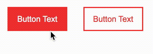
What should happen – and happens in the Designer and on the published site:
- By default, the base button has a red background colour and a red border. On hover, both the background and border turn blue.
- By default, the outlined button has no background, and a red border. On hover, the background turns red, the text turns white, while the border stays red.
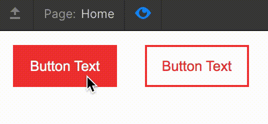
What happens in Preview mode:
- The solid button behaves as it's supposed to.
- On hover, the outlined button's background colour changes, but its border turns blue!
Why this is happening
The published site
To understand what's going on, let's look at the final outputted CSS on the published site. We can see the relevant styles:
.btn {
  margin: 1em;
  border-style: solid;
  border-width: 2px;
  border-color: #ec3838; /* red */
  background-color: #ec3838; /* red */
}

.btn:hover {
  border-color: #000dff; /* blue */
  background-color: #000dff; /* blue */
}

.btn.btn--outline {
  border-color: #ec3838; /* red */
  background-color: transparent;
  color: #ec3838; /* red */
}

.btn.btn--outline:hover {
  background-color: #ec3838; /* red */
  color: #fff; /* white */
}
It's a bit clearer if we activate the hover style on the outlined button in Chrome Dev Tools (other browser flavours are available...) – see the following screenshot.
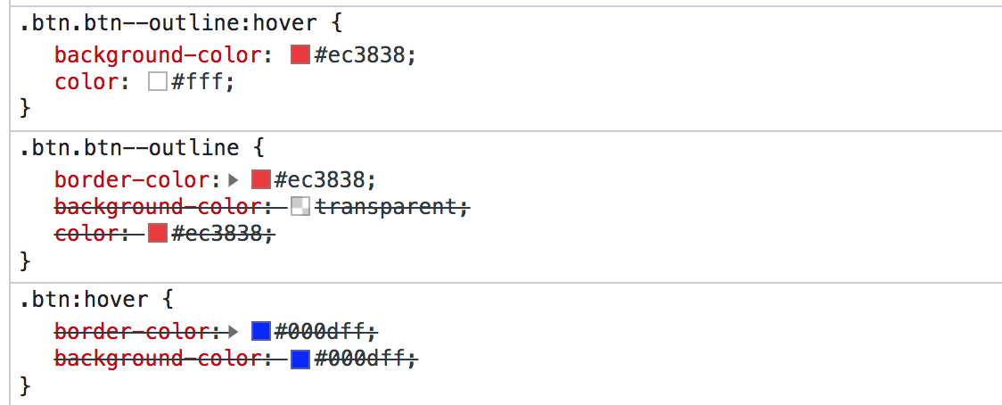
We can see that the when the outlined button is hovered, it correctly keeps the red border colour that is applied to its default state. The blue border colour applied to the hover state of the base class .btn is being ignored.
This is because the selector .btn.btn-outline appears later in the stylesheet than the selector .btn:hover, so it overrules it.
Great, that's what we want.
Preview mode
Ok, now let's look at the Preview mode in Webflow - here's another screenshot:
Oof, there's a bit more going on here.
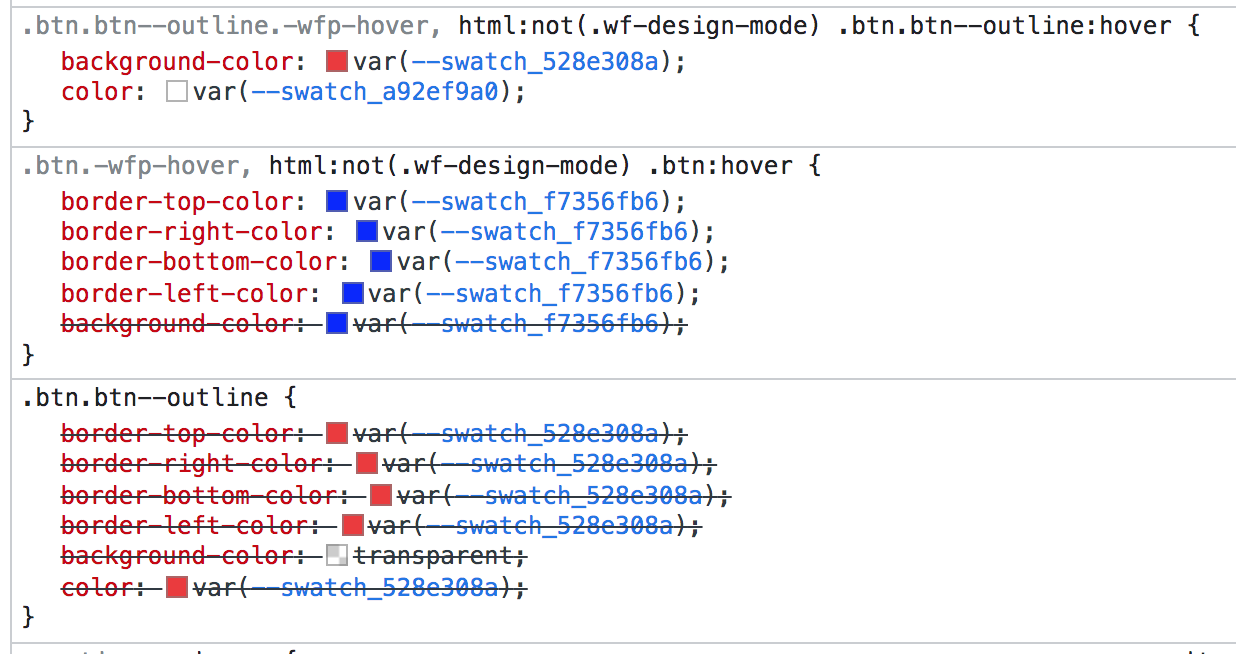
Evidently there's a difference between Webflow's final, clean outputted CSS on the published site, and what's used in Preview mode – that's to be expected. We can see a few key differences, like the fact that CSS custom properties (variables) are being used for the colours here, and that individual border colours are declared. No biggie.
What's interesting, and the source of our little problem, is the changes to the selectors for hover states.
Webflow is using the following selector for the hover state on the solid button:
.btn.-wfp-hover, html:not(.wf-design-mode) .btn:hover {}We'll disregard the first part before the comma as that's not relevant here – it's the second part we're interested in.
An extra selector is being used to target elements only if we are not in the Webflow Designer. (I'm guessing this is simply to avoid hover states being activated when designing, as it could cause all sorts of layout shift issues etc.)
What this means however, is that the selector html:not(.wf-design-mode) .btn:hover has a higher specificity than the selector .btn.btn--outline – the browser applies a greater weighting to this first selector.
You can see how the specificity is calculated using a calculator like this one – screenshot of the result below. We can see that the first selector (the hover styles on the base class) gets a specificity of 031, while the second (the default styling on the combo class) only has 020.
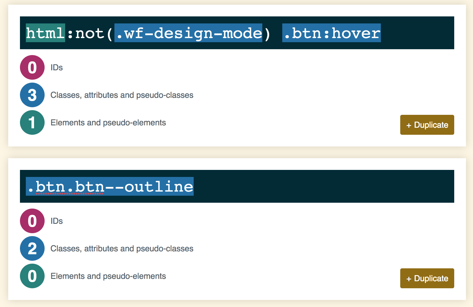
Because the hover styles on the base class are setting a border colour (and the hover styles on the combo class are not), our outlined button ends up with a blue border. Boo!
Fixing this
To ensure Preview mode displays hover styles correctly, one solution (and possibly the only real one) would be to declare values for each relevant CSS property explicitly. So for example, on the combo class, we would explicitly say that on hover, the button should have a red border.
The problem with this is that, depending on the scope and size of your site, (a) you could have to set a lot more properties on hover, and (b) it just adds unnecessary bloat to your CSS.
The alternative is to disregard the issue, and accept that you need to view the published site to see all styles accurately. If you're using a lot of custom JS and CSS code that doesn't work on the Preview site anyway, this may not be so much of a problem for you. For myself, I use Preview mode quite a bit to review and debug sites, so not seeing accurate styling here is something that would frustrate me.
I've flagged this is as a bug to the Webflow support team – we'll see if anything comes of it. To properly fix this behaviour, Webflow would need to increase the specificity of the outline button's default styling selector to match.
Other notes
A few other comments:
- This behavior may not be limited to hover states – I've not tested it with focus states, active states etc.
- I've also seen issues in Rich Text elements with combo classes not styling properly, but I'm yet to properly investigate this.
- Also – specificity, inheritance and the cascade are a complex beast and I don't claim to be an expert, so if you spot anything erroneous in the above – please do reach out to me on Twitter or via email and I'll be happy to adjust!