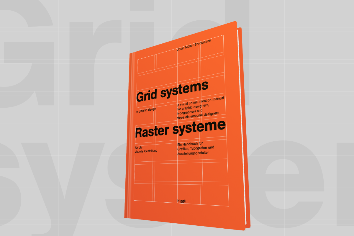
"Grid systems in graphic design" by Josef Müller-Brockmann is a classic book that will sit on many designers' bookshelves. It's a gorgeous slab of bright orange, and is an essential guide to setting up and implementing grids in design and typography.
This post is a run through how to create a responsive 3D mockup of the book in CSS. My tool of choice is Webflow, but the principles here will obviously work in 'regular' old CSS.
We'll start by building the front cover, setting up a grid system to position the content. Then we'll start to make the book 3D, and use gradients to add some slight detailing. While we're doing this, we'll keep responsiveness in mind, and try to set everything up in a way that can be easily scaled.
TLDR / a summary
Don't want to read the whole thing? Here's a link to a cloneable project in the Webflow showcase.
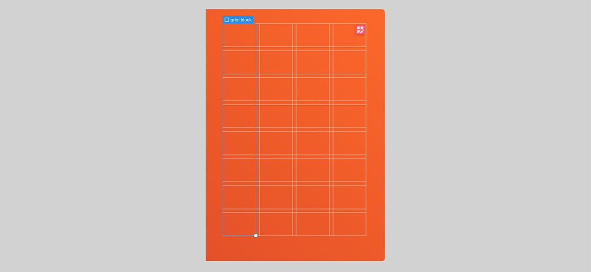
The cover grid
We use 3 grids placed on top of each other with position: absolute, all inside a wrapper element with position: relative.
.grid.grid--rowswhich is a single column with 8 rows, and 8 child elements with class.grid-block. These child elements have a border, which creates the horizontal lines..grid.grid--columnswhich is a single row with 4 columns, and 4 child elements with class.grid-block. This creates the vertical lines..grid.grid--contentwhich is 4 columns and 8 rows. This creates the 32 cells to hold the text content.
<div class="grid-wrapper">
	<div class="grid grid--columns">
	  <div class="grid-block"></div>
	  <div class="grid-block"></div>
	  <div class="grid-block"></div>
	  <div class="grid-block"></div>
	</div>
	<div class="grid grid--rows">
	  <div class="grid-block"></div>
		/* 7 more grid-blocks */
		...
	</div>
	<div class="grid grid--content">
		/* text content goes here */
		...
	</div>
</div>
.grid {
position: absolute;
inset: 0%; /* this is just top, left, bottom, right in one property */
display: grid;
width: 100%;
height: 100%;
grid-auto-columns: 1fr;
grid-auto-rows: 1fr;
grid-template-columns: 1fr;
grid-template-rows: 1fr;
grid-row-gap: 1.6%; /* define grid gaps relative to the cover size */
grid-column-gap: 2.3%;
}
.grid.grid--columns {
grid-auto-flow: column;
}
.grid.grid--rows {
grid-auto-flow: row;
}
.grid.grid--content {
grid-auto-flow: row;
grid-template-columns: repeat(4, 1fr);
grid-template-rows: repeat(8, 1fr);
}
.grid-block {
border-style: solid;
border-width: 1px;
border-color: #ffc4ad;
}A few comments:
- We've chosen to not define the explicit grid dimensions of
.grid—rowsand.grid—columns- we've just let them be defined by the number of child.grid-blocks in each. - I originally set the
.grid-blockborders as white, and then reduced the opacity slightly. Unfortunately because we're stacking these blocks you then get some overlap. There's probably a way around this, but I chose to instead make the borders a solid light orange colour. - You'll notice the grid gaps are set as percentage values. This is so the gaps scale relative to the cover. Unfortunately Webflow doesn't currently let you define grid gaps as percentages, so this needs to be set in custom code.
Cover dimensions
I got out an old fashioned ruler for this bit. The cover has a ratio of 1:1.41. To keep the proportions the same at any screen size, we use the padding-bottom trick (here's a link to a CSS Tricks article that goes into depth on this):
- We create a parent element that defines the width of the book,
.book, and give it a width - say 30vw. - Then on the child
.coverelement we set a width of 100%, a height of 0px, and a padding-bottom of 141%. This works because the padding-bottom (and padding-top) of an element is dependent on the parent element's width, when the padding is declared in percentages. Magic.
The .cover__padding element then just adds in some spacing between the edge of the book and our grids.
<div class="book">
	<div class="cover">
	  <div class="cover__padding">
	    <div class="grid-wrapper">
	      ...
	    </div>
	  </div>
	</div>
</div>
.book {
width: 30vw;
}
.cover {
position: relative;
width: 100%;
height: 0px;
padding-bottom: 141%;
background-color: #fe5a19;
}
.cover__padding {
position: absolute;
inset: 0%;
width: 100%;
height: 100%;
padding: 8% 10.2% 14% 9.3%;
}Typography
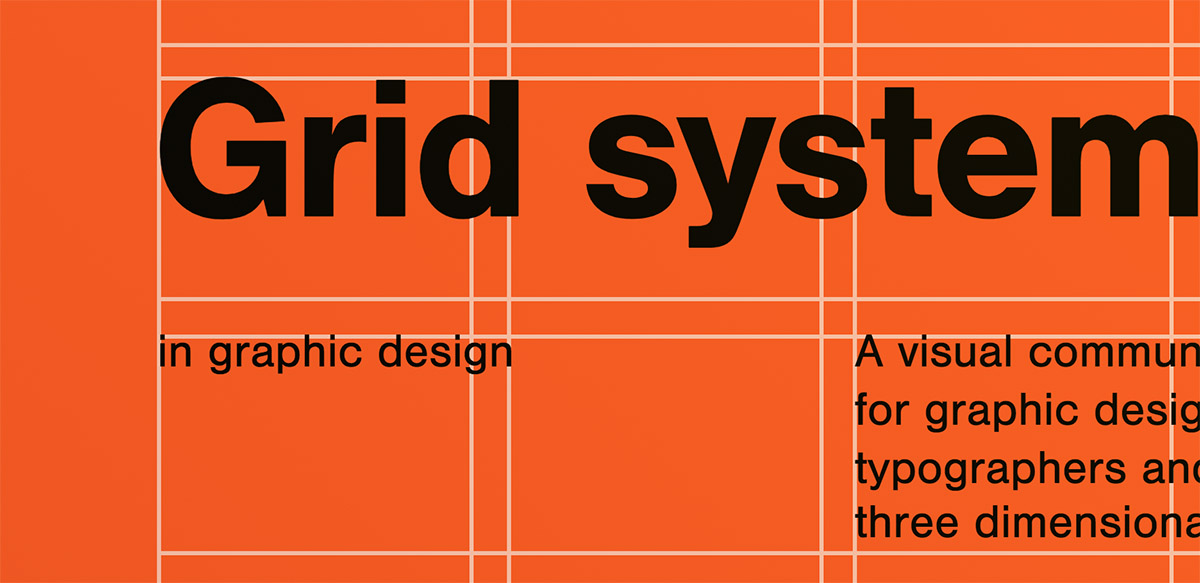
Positioning the text elements
To place each text element in the appropriate place in our 32-cell grid, we define the grid-row-start, grid-row-end, grid-column-start and grid-column-end properties for each element. This lets us stretch the elements over multiple cells.
Font
I didn't identify the exact font used on the original cover, although What the font! suggested Nimbus Sans from Adobe fonts as a decent match, so I went with that.
Setting an initial font size in vw
Setting the font-size was tricky.
We want the fonts to scale exactly with the book - so ideally the font-size would be a % of the book width. However there was no obvious way of setting font-size relative to the container width (although I think it could be done with SVGs), so instead we use vw units, so the text scales with the browser width.
I adjusted the size of the font-size on the <h1> and <p> elements until I found a size that was as close to the original cover as possible.
Line height
There's not a lot of text on multiple lines here, so I wasn't unduly worried about line height. Also, once the font-width was fixed, as long as line height was dependent on the font size (e.g. by declaring it without units), then there'd be no issues on changing screen size.
I set the line height on the <h1> elements to 1 and on the <p> elements to 1.2, which looked good by eye.
I also removed the default top and bottom margins on text elements to make it easier to align the text.
Fine-tuning x and y position
You'll notice on the original cover that certain text items have been carefully positioned so the edges of letters line up with the white lines. By default letters have a little spacing around them, so I applied slight x and y transforms to the <h1> and <p> elements to fine-tune their positions with respect to the lines - with these transforms declared in em, so they'd scale with the text.
I also modified letter-spacing at the same time to best match the original cover.
Responsiveness and smarter CSS
We've defined the cover width in vw, and we've defined the text sizes in vw. But what if we later want to change the overall cover size to say, 60vw? We'd have to change all the text sizes too. (And - sneak preview, we'd have to change other values for our 3D book too!).
So instead of having all these 'magic numbers', we can use CSS custom properties (aka CSS variables) to define just a single thing that everything else can be dependent on. We add the below CSS as custom code:
.book {
    --cover-width: 30vw; /* this lets us change the width of the cover */
    --type-heading: 12.1;  /* this is the required size of the h1 in vw if the cover were 100vw */
    --type-para: 2.8; /* this is the required size of the p in vw if the cover were 100vw */

    width: var(--cover-width); /* width of cover */
    }

  h1 {
  	font-size: calc( var(--type-heading) * ( var(--cover-width) / 100) ); /* calculate h1 font size based on cover width */
    }
  p {
  	font-size: calc( var(--type-para) * ( var(--cover-width) / 100) ); /* calculate p font size based on cover width */
    }
Ok, so what's this doing?
Well, we're defining a default cover width of 30vw and storing this value. We're also defining default heading and paragraph sizes relative to a 100vw book.
We then use this default cover width for our actual .book width.
And then for the headings and paragraphs, we're scaling their font sizes relative to the cover width. So for a 30vw book, we scale the font sizes by 0.3.
Then, if down the road, we decide we want our book to be twice as large, we just change the --cover-width value and everything else scales. Neat.
Going 3D
We've made a flat cover - now let's add another dimension to it.
Adding perspective to the parent
There are plenty of guides out there that cover how to create a basic 3D cuboid in CSS, including some by Webflow themselves, so I won't go into loads of detail.
We start out by adding a wrapper to the book, and adding some perspective to it. In the Webflow UI, this is under the Children Perspective > Distance setting. This is effectively how far the user is from the Z-plane that the element sits on. (You can read more about perspective at CSS Tricks). I've gone for 1200px here.
.book-wrapper {
  perspective: 1200px;
}<div class="book-wrapper">
<div class="book">
<div class="cover">
...
</div>
</div>
</div>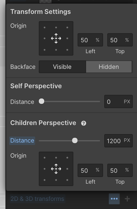
Back cover
We'll start by adding the back cover.
<div class="book-wrapper">
	<div class="book">
		<div class="cover">
			...
		</div>
		<div class="back-cover">
			...
		</div>
	</div>
</div>
We want this to be the same size as the front cover - here I've just used position: absolute and inset: 0 to achieve this.
We then want to move it backwards in 3D space - we apply two transforms, one to move it back by the width of the book's spine and one to rotate it 180 degrees around the y-axis, so it's facing backwards.
But how do we define the width of the book's spine? We could just use a value in vw, e.g. 2vw, and this would still scale responsively. But if we decided to change the width of the cover onscreen with the --cover-width value above, we'd have to change this spine width manually too. You can see where this is going - we instead set the spine width relative to the cover width:
.book {
    --cover-width: 30vw; /*this lets us change the width of the cover */
    --thickness: calc( var(--cover-width) / 10 ); /* define spine thickness as a fraction of cover width */
    }
 .spine {
  	width: var(--thickness); /* width of spine */
    }
	.back-cover {
		transform: /* position back cover behind front, and rotate it 180 deg */
	    translate3d(0px, 0px, calc( var(--thickness) * -1 ))
	    rotateX(0deg)
	    rotateY(180deg)
	    rotateZ(0deg);
		}
Here we've defined a property --thickness as a fraction of the cover width. We then use this to set the translation of the back cover along the z-axis.
Spine
We also use this value to set the width on a .spine element.
<div class="book-wrapper">
	<div class="book">
		...
		<div class="spine"></div>
	</div>
</div>
This spine element is set with position: absolute and left: 0px to place it at the left edge of the book, and then rotated in 3D space 90 degrees to be perpendicular to the cover. We also want to change the transform origin to left: 0%, so we are rotating around the left edge of the element.
(This transformation is not dependent on our custom CSS properties above, so can be set as usual in Webflow rather than in the custom code.)
Pages
We create three white .pages elements - for the top, right and bottom edges of the book.
Like with the spine, to position them in 3D space we rotate each element around the appropriate edge, modifying the transform origin as required.
However, in order to make the book more realistic, we also apply an offset to each page element to account for the gap between the edge of the pages and the edge of the cover.
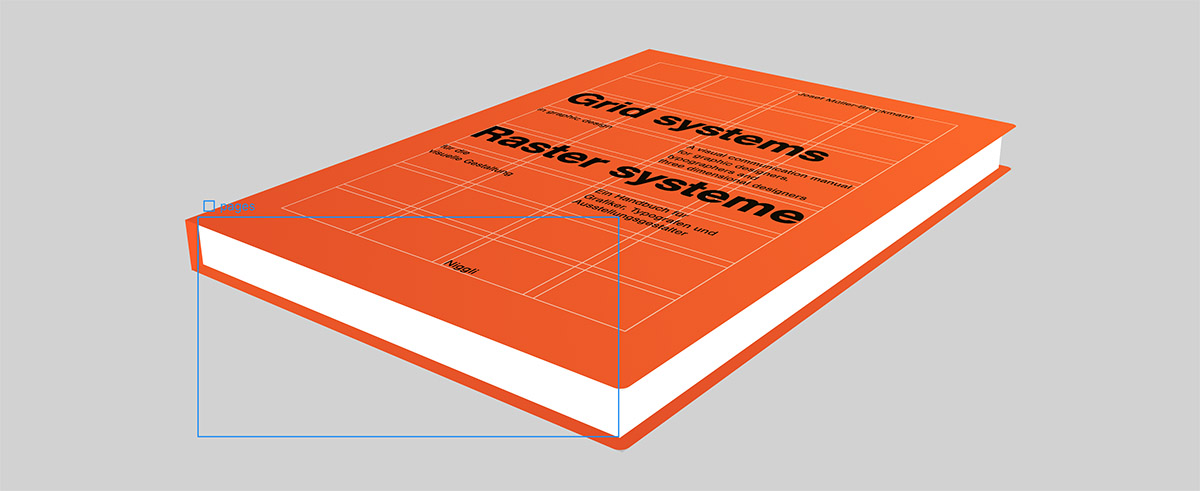
Again, we want to keep this measurement relative to the book size, so we declare another property relative to the cover width (here we've set it as a quarter of the spine thickness, which seems sensible).
--cover-offset: calc( var(--thickness) / 4 ); /* define the offset between the cover edge and the
pages edge as a fraction of the spine thickness */
We then need to set the following things respective to this property:
- the horizontal length of the top and bottom page elements
- the vertical height of the side page element
- the y-position of the top and bottom page elements
- the x-position of the side page element
For example, for the top element, we set the following in custom CSS:
.pages.pages--top {
   	  height: calc( var(--thickness) - 2px) ; /* if the pages divs are exactly the width of the spine, we end up with a
         faint white artifact down the covers, so we make them slightly smaller */
      right:  var(--cover-offset); /* we don't want the pages to go all the way to the edge of the cover */
      transform: /* position top page div, rotate and nudge by 1px to avoid artifact */
				translate3d(0px, var(--cover-offset), -1px)
				rotateX(-90deg)
				rotateY(0deg)
        rotateZ(0deg);
    }
You'll notice the 1px / 2px values above - these are little shifts I added to remove white artifacts that appeared along the page edges in the orange covers.
Animating in 3D space
I explored a few different ways of animating the book. I settled on rotating the book according to x and y mouse position. The effect is of a smooth change in viewing angle as you move your mouse over the page.
This animation was set up entirely with Webflow interactions with a 'mouse move over element trigger' set on the .book-wrapper element.
Moving the mouse in the x-direction caused a rotation on the .book element from -120 degrees to 120 degrees around the y-axis. This allows the user to spin the book nearly all the way round to see the back cover.
In the y-direction we don't need as much rotation (you'd tend to flip over a book in you hands sideways, rather than end over end!), so we just do -30 degrees to 30 degrees around the x-axis.
Adding detail
We can add a few quick details to add a little more realism to the book:
Cover fold
A div with a linear-gradient background-image positioned near the left edge of the cover serves to give the impression of an indentation where the cover dips in by the spine.
background-image: linear-gradient(90deg, transparent, rgba(0, 0, 0, 0.1) 34%, hsla(0, 0%, 100%, 0.3) 47%, hsla(0, 0%, 100%, 0) 59%, hsla(0, 0%, 100%, 0.23) 75%, hsla(0, 0%, 100%, 0));Cover edges
A slight border radius on the outer edges of the cover and back cover make the book look a little more realistic. (Note that these are evidently not relative to the book size - they probably should be!)
border-top-right-radius: 0.5vw;
 border-bottom-right-radius: 0.5vw;
Page detailing
A repeating linear gradient on each of the page elements gives the impression of pages:
background-image: repeating-linear-gradient(180deg, rgba(0, 0, 0, 0.19), hsla(0, 0%, 100%, 0.1) 5%);Cover lighting
A faint linear gradient from top right to bottom left gives a faint suggestion of a light source from the top right.
background-image: linear-gradient(45deg, rgba(10, 0, 56, 0.1), rgba(252, 225, 25, 0.1));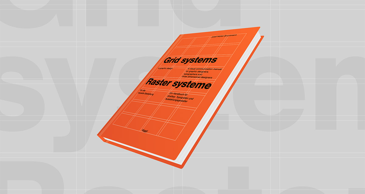
Final changes on small screens
The final step is to modify how we want the book to appear on smaller screens. Because we've set it up to scale according to browser width, we'll likely end up with something that's too small on mobile. To solve this I simply added a media query to bump up the value of -cover-width on mobile
@media (max-width: 900px) { /* on smaller screens we make the book a bigger fraction of the screen width */
  	.book {
    	--cover-width: 70vw;
    }
  }
I also modified the animation on mobile, since mouseover is obviously not a thing on touch screens - and instead using a simple 'click to rotate' animation.
Extending this
To wrap up, here's some thoughts about how to use or extend this further:
- You could make the book thickness / page count dependent on a Webflow collection item value via a dynamic embed. Similarly with the cover dimensions and actual cover imagery.
- There's obviously scope to make the books even more realistic - our covers have no thickness for example!