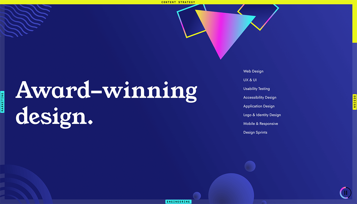
This post is a run-through how to create sticky scrollbars that scroll along the top, right, bottom and left of the viewport while a user scrolls vertically through four sections of a site.
I came across this layout on Clique Studios' website, a US-based design and development agency, and thought it would be a fun task to try to recreate something similar in Webflow.
Here's a link to the page with the effect: Clique Studios - Approach. Pretty neat.
NB - this post is specifically about how to create this effect with Webflow interactions, but the majority of this setup will work anywhere - it's just good old HTML and CSS - apart from the animated scrollbars of course, which would require some JS adding to set up.
TL;DR
Not fussed about reading the full post? Here's a link to a cloneable Webflow site with this all set-up.
Outline
There are a few different things going on here.
-
First, we need to create a sticky element that, once scrolled fully into view, fills the viewport and remains fixed until we've finished scrolling through the page sections.
-
Second, we need to create four bars that are fixed to the outer four edges of the viewport.
-
Third, we need to fill each of these bars with a background colour of some sort as we scroll through each section.
There are a few other elements and behaviours going on in the original site, like the way the sticky section isn't quite full width at first, but then grows - but we're going to keep it simple and just look at the scrolling stuff.
Part 1 - adding our content sections and sticky element
Ok, so first we want to add our content sections.
We'll create a parent element to define the area we're scrolling through, we'll call this .section-scroll.
In this we'll then add our four child content sections called .section. We'll want each of these to occupy the full screen, so we'll add the following CSS in Webflow:
.section {
	height: 100vh;
	width: 100%; /*not strictly necessary as long as the parents are all full-width*/
}
We'll now add our sticky element as a child of .section-scroll, which we'll call .sticky. We'll also make this occupy the full viewport, as well as adding position: sticky:
.sticky {
	height: 100vh;
	width: 100%;
	position: sticky;
	top: 0px;
}
We've also added top: 0px to this to get this to work. This means that .sticky will behave like a normally-positioned div until it reaches 0px from the top of the viewport, at which point it will become fixed, until we scroll to the end of its parent .section-scroll.
The problem now is that, because .sticky is 100vh tall and simply placed before our content sections in the DOM, we have to scroll through 100vh before we first see our content in the first .section.
To get around this, we'll add a wrapper element called .sticky-wrapper, to which we'll give position: absolute. This will then lift the sticky section out of the normal flow of the page content, so when scrolling we'll immediately see our content sections.
We'll need to give the parent position:relative to give the wrapper something to target.
We'll also set the top, right, bottom, and left properties of the wrapper to 0px to make this wrapper as large as the parent .section-scroll.
.sticky-wrapper {
	position: absolute;
	top: 0px;
	bottom: 0px;
	left; 0px;
	right: 0px;
}
.section-scroll {
	position: relative;
}
Now we should find that our sticky section is placed on top of our content sections, and we can scroll through the four content sections straight away.
Part 2 - adding the bars
The bars around the four edges can probably be done a few different ways, so I make no claims as for the efficiency of the approach here - it can almost certainly be simplified and/or improved.
The method I've followed here is that each bar is made up of three elements:
- An absolutely-positioned
.barplaced along each viewport edge. - An absolutely-positioned
.bar__fillthat covers each.bar. This is what we'll animate on scroll. - An absolutely-positioned
.bar__contentthat places a button on each bar. (I've not gone into detail here on this, but see Extending this layout below)
The .bar elements are each styled slightly differently to place them along each edge. Each is given a fixed width/height of 60px. I'm sure it's possible to make the size of them scale according to their text content, but I was happy hard-coding this size.
.bar.bar--top {
	position: absolute;

	top: 0px;
	bottom: auto;
	left: 0px;
	right: 0px;

	height: 60px;
}

.bar.bar--right {
	position: absolute;

	top: 0px;
	bottom: 0px;
	left: auto;
	right: 0px;

	width: 60px;
}

.bar.bar--bottom {
	position: absolute;

	top: auto;
	bottom: 0px;
	left: 0px;
	right: 0px;

	height: 60px;
}

.bar.bar--left {
	position: absolute;

	top: 0px;
	bottom: 0px;
	left: 0px;
	right: auto;

	width: 60px;
}
The .bar-fills are each absolutely positioned with a coloured background:
.bar__fill {
	position: absolute;

	top: 0px;
	bottom: 0px;
	left: 0px;
	right: 0px;

	background-color: yellow;
}
For each we then apply a 2D transform to scale them to 0 along the X or Y axis, and adjusting the transform-origin as appropriate - so when animated, the bars will slide out in the correct direction:
.bar__fill.bar__fill--top {
	transform-origin: 0% 50%;
	transform: scale(0, 1);
}

.bar__fill.bar__fill--right {
	transform-origin: 50% 0%;
	transform: scale(1, 0);
}

.bar__fill.bar__fill--bottom {
	transform-origin: 100% 50%;
	transform: scale(0, 1);
}

.bar__fill.bar__fill--left {
	transform-origin: 50% 100%;
	transform: scale(1, 0);
}
Part 3 - animating the bars on scroll
Now the fun bit. We want to fill each of these bars with a background colour as we scroll down through the content sections.
First, we'll create an invisible trigger element for the scroll inside .section-scroll. We'll call this .scroll-trigger. This is what's going to fire and end the animation.
We give this trigger the following CSS:
.scroll-trigger {
	position: absolute;
	top: 100vh;
	bottom: 100vh;
	width: 1px;
	left: 0px;
	right: auto;
	opacity: 0;
}
This creates a thin, tall element on the far left of our viewport, that starts 100vh from the top of our scrolling section, and 100vh from the bottom.
We've given it an opacity of 0 although it has no colour by default anyway. Note that setting it to display: none causes the animation to not fire, so don't do this (I assume since it's never actually then visible in the viewport). We've also made it 1px so it doesn't interfere too much with any clickable elements like the bar buttons.
An aside - why we're creating a separate trigger
Why do we need a separate trigger? Couldn't we use one of the existing elements?
The issue lies with when we want the animation to start and end. We want the animation to start (0%) when our first content section (and our fixed element) are fully in view. And we want it to end when our final content section is fully in view.
Webflow gives us a couple of options for setting the animation boundaries:
- Start when element starts entering
- Start when element is fully visible
- End when element starts exiting
- End when element is fully invisible
Since we're scrolling for several times the viewport height, we need our scroll trigger to be very tall - so the is fully visible boundary isn't going to work (the trigger will never be fully visible in the viewport). So we need to start when an element starts entering the viewport.
We don't currently have an element that starts after the first content section has fully popped into view (other than the second content section, but that's only 100vh tall anyway). So we need to create a trigger element that starts 100vh after the top of .section-scroll.
Webflow also gives us the option to add offsets, but as far as I can tell these are intended to be used for small percentages of the viewport height. When testing I found these of limited use and a bit unpredictable in their behaviour. They also don't help with ending the animation either.
Okay, back to the animation
On this trigger, we create a "While scrolling in view" animation with Webflow and call it scroll. Our animation boundaries are then:
- 0%: When element starts entering
- 100%: When element is fully invisible
Within the animation we then create keyframes at 0%, 25%, 50%, 75% and 100%.
At each of these percentages, we are scaling each of the four bar fills from 0 to 1, along either the X or Y axis.
- So at 0% of the animation, we set the X-scale of
bar__fill--topto 0. - At 25% we set the X-scale of
bar__fill--topto 1, and the Y-scale ofbar__fill--rightto 0. - And so on...
Since the trigger element is not a parent or sibling of these bar fills, we also need to ensure that we are affecting "all elements with this class".
Now, as we scroll down through the content sections, we should see each bar fills up with colour. Hurrah!
Finishing off and extending this
Browser compatability
In terms of position: sticky, this has reasonable compatability across browsers. No go in IE, of course.
I don't believe there's anything else with major compatability issues, but shout if I've missed something!
On mobile and smaller screens, as it's currently set up, things will likely break down. I'd recommend simplifying your layout since the fixed viewport height and fat scrollbars aren't particularly mobile-friendly.
Section links
In the Webflow cloneable (also linked above) I've also added buttons to each of the four content sections inside the bars.
I won't go into details here, but it's a case of absolutely-positioning each of these buttons and then rotating them into place - see the link for more.
I've positioned these buttons separately from the actual bars and bar fills, but you could almost certainly simplify the structure by placing the buttons inside the bars and then rotating the bars into place. This might potentially then simplify the animation too by allowing you to scale everything along the x-axis rather than having both x and y-scaling, I haven't dug into this.
Adding more sections
What if you want more (or less) than four sections of content?
Well, there are only four sides to a rectangle. But another shape would probably work too - you'd just need to get a bit clever with your positioning and rotating (and adjust your animation keyframes accordingly). It's likely that an SVG would work better in this case, since it'd be much easier to draw, and then you could animate with a path animation - although you'd need a few lines of custom code to implement.
Why not try this with a different shape and let me know how it goes?