
[space size="50px"]
Introduction
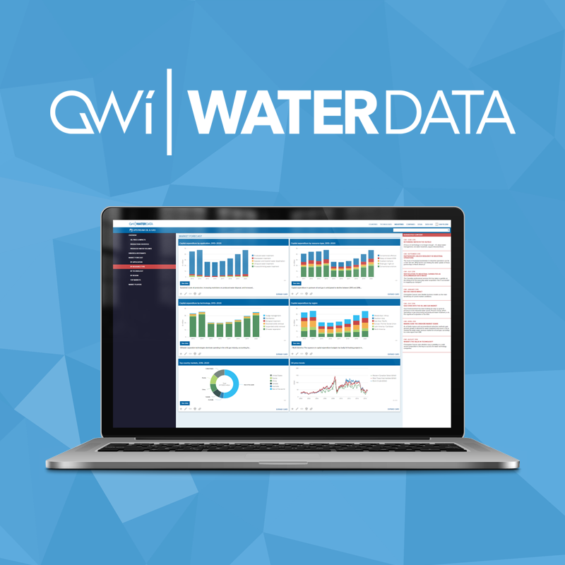
WaterData is an analytics and market forecasting tool for the water industry produced by Global Water Intelligence. I was responsible for the product's interface and information design, as well as branding and marketing materials, alongside the production process for much of the content.
Brief
GWI produces several market reports each year that explore different topics within the water industry, each with associated charts, datasets, forecasts and textual analysis.
The aim of the project was to combine all of GWI's report offerings into one centralised service, letting users (both clients and internal staff) explore the data more freely, as well as connecting related content in a way that was harder to do in print.
In addition, existing clients had requested specific features such as the ability to customise charts and download them for use in presentations.
Understanding the content structure
Alongside the research and development teams, we began by taking stock of all the content we needed to include.
With so much content being pulled together from different sources, it was clear the product needed to be divided into different areas, and offer different entry points - so users could begin exploring the site by country, company, industry, water treatment technology, and so on.
Each of these entry points was given a 'hub' page that hosted top-level information (e.g. for countries, it might contain summaries of global trends). Users could then drill down to child pages (e.g. specific countries) and topics (e.g. sector structure), and finally down to the content elements - charts, datasets, graphics or text.

User flows
Some content had a less straightforward structure. For example, an external data hub held datasets assembled from hundreds of different sources that were used to define dozens of country-specific indicators. Here we mapped out primary and secondary user flows to explore the different content permutations and pathways a client could take between datasets, countries, indicators and sources.

Designing the UI
To allow for rapid iterations, I began by sketching out wireframes by hand and getting feedback from stakeholders within the research team, before developing them into mock-ups to be passed to the development team.
We decided to opt for a modular, card-based interface, since much of the content could be packaged up into discrete elements - individual charts, diagrams and tables. The print reports had historically been long-form and text-heavy, but feedback from clients indicated they generally wanted easy access to specific content or data. By breaking the content into bitesize chunks, categorising and tagging them it enabled users to focus in on the content they wanted.

The UI design was influenced heavily by Google's Material Design. We needed something very clean that wouldn't get in the way of what mattered, the data. Bold colours, simple shapes and lots of white space all helped to build a design system that met this requirement.

Search functionality
One of the features we were keen to include was an effective search function. From feedback we knew users often picked up a report looking for a specific dataset or piece of information.
By tagging each modular content element, we were able to build a search tool that let users filter results by country, technology, company and so on, as well as by content type. Adding predictive, live-updating functionality meant searching for a specific chart was even quicker.

Presenting the data
Good data visualisation was of course very important in this product. Most graphics on the site fell into one of three categories:
Standard charts Bar, line, pie, and so on. These were built using Highcharts, a JS charting library used elsewhere in GWI's product offerings. Highcharts allows for plenty of customisation, so I defined various rules for the dev team to implement to ensure the charts' styling was in keeping with the rest of the site.
Chart legends doubled as filter controls, so users could pick and choose the data to show. A "Show data" button expanded each card to let the user view - and download - the raw data behind each chart.

Static SVG graphics Much of the graphical content came from pre-existing reports, so it was a matter of converting dozens of AI and PDF files to SVG, restyling where required. Some graphics were enhanced by the addition of some JS interactivity like tooltips and hover effects. See here for a live example.
'Fancy' charts Some data was more complex and visualising it required a more involved approach. We needed to include diagrams showing the structures of hundreds of companies, each with parent companies, shareholders, subsidiaries, offshoots, brands and so on. Highcharts didn't offer a suitable chart type, and D3.js's tree diagram functionality wouldn't support multiple parent elements, so I customised a D3 Sankey chart algorithm that we were able to use instead. Colour-coding, tooltips and links to relevant company pages were the final touch.

The DataHub
In addition to the main content hubs, we needed a separate location to hold other large datasets, such as records of company acquisitions and water tariffs in cities around the world.
Each of these required developing a unique interface or dashboard to best display the content.
Simpler datasets, such as a record of water treatment projects, could be presented in table form. Controls allowed filtering by country, type etc, and clicking on a row provided further information, either by expanding the row, or taking the user to a detail page.
A database of regulations relating to water quality, on the other hand, required designing an interface that supported the more intricate relationships between regulatory bodies, frameworks, chemicals and countries.

Icons and other details
I also created various other visual elements for the product, including tooltips and a number of icon systems - for cards, search, topics and so on.
Icons were already in use across GWI's products so it was important to try to retain the same symbols and meanings where possible, while at the same time ensuring all the required icons were available.

Summary
The final product was received well by internal and external users. The scale of the project and time pressures meant that some features were not initially available at launch, but these were added during later updates, along with additional content sections.
